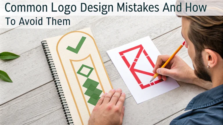
A well-designed logo serves as the cornerstone of your brand’s visual identity, yet many businesses stumble into common design pitfalls that can weaken their brand impact.
Basic Logo Design Mistakes
- Using Too Many Colors: Limit your logo palette to 2-3 colors maximum for better recognition and reproduction across different mediums.
- Relying on Trends: Avoid following temporary design fads that might make your logo look dated within a few years.
- Complex Designs: Keep your logo simple enough to be recognizable at any size, from business cards to billboards.
- Poor Font Choices: Select typefaces that match your brand personality and remain legible across all applications.
Technical Issues to Watch For
- Low Resolution Files: Always create logos in vector format using software like Adobe Illustrator to ensure scalability.
- Incorrect Color Modes: Prepare different versions for both RGB (digital) and CMYK (print) applications.
- Missing Variations: Design multiple versions including full color, black and white, and reversed options.
Professional Solutions
Work with a professional designer who understands both design principles and technical requirements.
Request a complete logo package that includes different file formats (AI, EPS, PDF, PNG, JPG) and color variations.
Test your logo design across different applications and sizes before finalizing.
Quick Tips for Better Logo Design
- Research your competitors to ensure your design stands out
- Sketch ideas on paper before moving to digital
- Consider how the logo will look in one color
- Test the design in black and white first
- Ensure it works at both very small and large sizes
Resources for Logo Design
Professional design organizations like AIGA (www.aiga.org) offer guidelines and best practices for logo design.
Software recommendations include Adobe Illustrator, Affinity Designer, or CorelDRAW for professional logo creation.
| Common Mistake | Solution |
|---|---|
| Overcomplicated design | Simplify to essential elements |
| Poor scalability | Use vector graphics |
| Generic design | Research market and create unique concepts |
Final Checklist
- ✓ Logo is simple and memorable
- ✓ Design works in one color
- ✓ Readable at different sizes
- ✓ Unique from competitors
- ✓ Properly formatted files available
Implementation Strategy
Creating an effective logo requires a systematic approach that combines creative vision with practical execution.
Timeline Planning
- Research phase: 1-2 weeks
- Concept development: 2-3 weeks
- Design refinement: 1-2 weeks
- Client feedback and revisions: 1-2 weeks
- Final file preparation: 1 week
Brand Integration
Your logo should seamlessly integrate with other brand elements while maintaining its distinctive characteristics.
- Style Guide Development: Create comprehensive guidelines for logo usage
- Brand Consistency: Establish rules for placement and spacing
- Digital Integration: Optimize for social media profiles and web applications
Testing and Validation
| Test Type | Purpose |
|---|---|
| Focus group testing | Gather audience perception |
| Technical validation | Verify reproduction quality |
| Digital display testing | Check screen performance |
Conclusion
A successful logo design requires careful attention to both creative and technical aspects. Avoiding common mistakes while following professional guidelines ensures your logo will effectively represent your brand for years to come.
Invest time in proper planning, execution, and testing to create a logo that not only looks professional but also functions effectively across all business applications.
Next Steps
- Schedule regular brand audits
- Monitor logo performance across platforms
- Update guidelines as needed
- Maintain consistent implementation
FAQs
- What are the most common color mistakes in logo design?
Using too many colors, choosing trendy colors that may become outdated quickly, and not checking how the logo appears in different color modes (RGB, CMYK, grayscale) are frequent mistakes. Stick to 2-3 colors maximum and ensure they work across all applications. - How can I ensure my logo is scalable?
Design your logo in vector format using software like Adobe Illustrator, avoid intricate details that may be lost when scaled down, and test your logo at various sizes from favicon to billboard dimensions to ensure legibility. - What’s the problem with using raster images in logos?
Raster images become pixelated when scaled up, lose quality when resized, and are difficult to modify. Vector formats maintain quality at any size and are industry standard for professional logo design. - Why should I avoid designing trends in logos?
Trends are temporary and can quickly make your logo look dated. Focus on timeless design principles that will remain relevant for 10-15 years, as frequent logo changes can harm brand recognition. - What’s wrong with using generic symbols in logo design?
Generic symbols like globes, arrows, and swooshes are overused and fail to differentiate your brand. Create unique, meaningful symbols that specifically represent your brand’s values and identity. - How can I prevent poor typography choices in logo design?
Avoid using more than two fonts, steer clear of overused fonts like Comic Sans or Papyrus, ensure proper spacing between letters, and select typefaces that match your brand’s personality and are legible at all sizes. - What spacing issues should I watch out for in logo design?
Maintain consistent spacing between elements, ensure proper padding around the logo, and establish clear guidelines for minimum clear space to prevent crowding when the logo is placed near other elements. - Why is designing for a single application a mistake?
Logos must function across multiple platforms and materials including digital, print, embroidery, and various backgrounds. Test your logo in all potential usage scenarios to ensure versatility. - What’s the issue with copying other brands’ logos?
Besides legal implications and potential copyright infringement, copying other logos shows lack of originality, can confuse customers, and fails to establish a unique brand identity in the marketplace. - How can I avoid making my logo too complex?
Focus on simplicity by using minimal elements, ensure the logo works in black and white, remove unnecessary details, and follow the principle that a child should be able to draw it from memory after seeing it a few times.


